
Super Mario Bros. 3 Happened Before Super Mario Bros. 2
There’s a reason Mario’s sprite in SMB2 looks better than his sprite in SMB3.
Japanese players beating Super Mario Bros. 3 upon its 1988 release would have been greeted with a first: Princess Peach looking more like she’d looked in official Nintendo artwork. Sorta. She is finally wearing a pink dress, after sporting a red-and-white number in both Super Mario Bros. and the Japanese sequel, but her SMB3 sprite has brown hair, even though she’d always been depicted in art as a blonde.
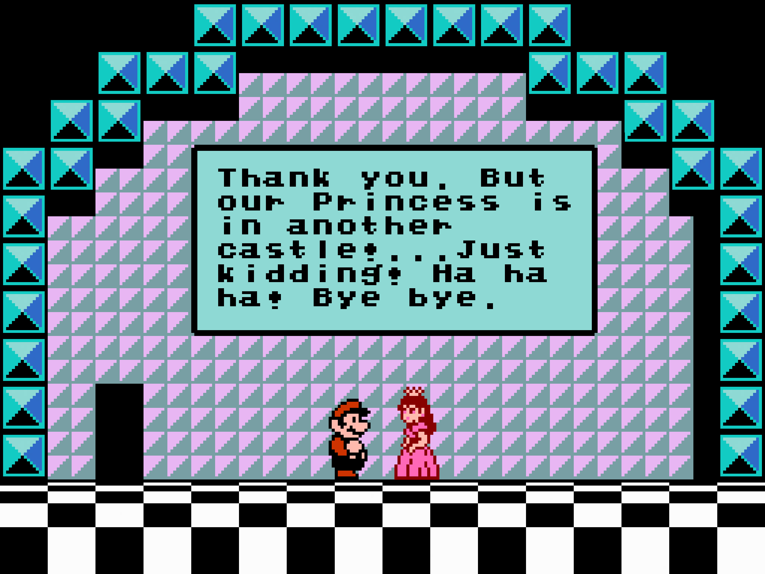
I’ve always assumed the graphical limitations of the NES are to blame for this brunette travesty of a princess. After all, the spritework in SMB3 is actually not Nintendo’s best from its 8-bit days. Even the sprite for Mario himself, if better than the original SMB one, leaves a lot to be desired. I mean, come on — black overalls???
For players outside Japan, however, the SMB3 ending scene played out differently. For me, an American kid who played SMB2 for years before I beat SMB3, Peach looked almost exactly as she had in SMB2. Given that SMB3 chucked nearly all of the elements introduced in the previous game, this read to me as a subtle acknowledgement that it all somehow still counted. Nintendo had not forgotten about the one game where Peach was playable, because the SMB3 version of her looked the same.
That might still be true, in a sense, but what is more likely the case here is that Super Mario Bros. 3 influenced what Peach would look like in Super Mario Bros. 2, and not the other way around, despite their release date order.
Production on SMB3 began in 1986, not long after the game we westerners call The Lost Levels was released, and it hit shelves in Japan on October 23, 1988. Meanwhile, Doki Doki Panic was released on July 10, 1987, and the game it became — SMB2 — hit American shelves on October 9, 1988, less than a month before Japanese gamers were getting their hands on SMB3. Based on the way game production works, it’s possible a lot of the graphics design for SMB2 were desigend after similar work had been done for SMB3. Sure, graphics can be revised and updated as a game moves through production, but I’m going to present some evidence that suggests Nintendo had already finalized Peach’s look for the ending of SMB3 — and then, while turning Doki Doki Panic into a Mario game for the west, used that pre-existing SMB3 sprite.
I recall reading about a connection between Mario’s sprites in SMB2 and SMB3, with one being based off the other in some kind of observable way. Despite my best efforts, I haven’t been able to to find the article that initially brought it to my attention — it was something I learned before the age of social media, and for all I know, it might have been on a message board that no longer exists. Googling around, however, I did find this tweet from artist and retrogaming enthusiast Philip Summers noting the strangeness of Mario’s SMB2 sprite looking better than the in SMB3 version: more colors, more accurate colors (even if the colors of his overalls and undershirt are swapped), and the addition of whites in his eyes, making him look overall more like the bright-eyed Mario you saw on the box art than some beady-eyed weirdo.
Via.
Summers concludes that the SMB2 version looks better because it was done later, when Nintendo designers had more years of experience working within the technical limitations of the system and could therefore pull off a sprite that was both functional and more accurate. What’s more, the reason Summers thinks the SMB2 sprites came about later is that there exists a prototype version of the game wherein Mario’s sprite looks like a halfway point between the SMB3 version and what ended up in the finalized version of SMB2. It’s almost as if Nintendo plunked in a barely modified version of the SMB3 Mario into the game and then touched him up after the fact.
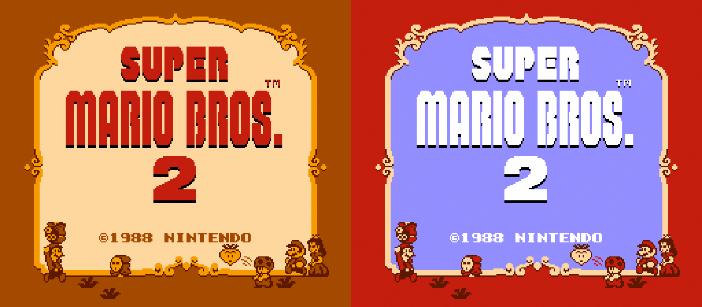
On the left: The brassy-toned title screen found on the SMB2 prototype. On the right: The blue-background version found in the finalized version. (Via The Cutting Room Floor.)
In 2005, eBay user Johan_1984 bought an NES cartridge containing the SMB2 prototype for a mere $350. There’s a detailed rundown of all the differences between this version of the game and the final one over at The Mushroom Kingdom, which describes the prototype as being a halfway point between Doki Doki Panic and SMB2. The most interesting change, for the purposes of this post, is the fact that between this prototype and the finalized version of the game, Mario, Luigi and Peach were each given a few white pixels to suggest more cartoony-looking eyes. (Toad, whose eyes are just little black dots in the official art, does not get white pixels.) It’s a testament to pixel art how much of a difference the white pixels make.
Blue background: The finalized sprites. Gold background: The beady-eyed prototype sprites.
And if you compare Mario’s sprites from SMB3, SMB2, and the SMB2 prototype, you can see how similar they are.
Blue background: SMB2. Gold background: SMB2 prototype. Green background: SMB3.
You can also appreciate how some slight changes make the SMB2 version of Mario look so much better. The addition of a single white pixel above his left eye makes his face appear to be turned at an angle rather than fully in profile. And moving his hand just slightly shows off his torso in a way that makes it very clear that he’s wearing overalls like we see in his official art. I also wondered why Nintendo decided against white pixels on his hands to suggest his iconic gloves until a commenter on this post pointed out that these extra white pixels are actually an entirely separate sprite sitting atop the previous one. This explains the tendency for the white pixels to flicker in the exact same way that Mega Man’s NES sprite does, since that sprite was constructed in a similar way. It’s explained in this video.
As for Peach, the addition of a few flesh-toned pixels give her a larger head and less of a weirdly low hairline. Again, it’s only two white pixels added to her eyes, but it makes a remarkable difference: With just pink to suggest her eyes, she either looks possessed or high.
Blue background: SMB2. Gold background: SMB2 prototype. Green background: SMB3.
The SMB2 version of Toad seems like an original sprite, unrelated to anything in SMB3, and we can’t do a comparison for Luigi because SMB2 is the only 8-bit Mario platformer where he’s given a unique sprite.
I suppose some people might disagree, but I feel like it’s hard to argue that the SMB2 pixels don’t look better than the ones in SMB3. Looking at the development timelines, it seems perfectly understandable that not only did the extra time pay off aesthetically but also the SMB2 sprites seem like improved versions of their SMB3 counterparts, rather than entirely new sprites.
Obviously, I like Super Mario Bros. 2. I talk about it a lot, including in this post, where I discuss the strangeness of this game hitting at the height of Mario mania in the United States, with all the tie-in merchandise capitalizing on the SMB2 version of Mario, turnip in hand. When Super Mario Bros. 3 came out and apparently ditched all that, it felt like a betrayal to me, a little kid who *loved* SMB2. Knowing how late SMB2 arrived in Mario’s 8-bit lifespan, I understand now that everything it brought to the series arrived after the fact. Nintendo wasn’t intentionally ignoring it; it was just that SMB2 was an asterisk on a story that had already finished in Japan. Super Mario USA — the Japanese release of the American SMB2 — hit shelves on September 16, 1992, almost two years after Super Mario World debuted and ushered in Mario’s 16-bit era.
For American gamers like me, the ending to Super Mario Bros. 3 really did seem like a callback. The actual story is so much more interesting, though. It was a flashforward to what was still to come… if one that arrived slightly late in the U.S. It was also a subtle hint that despite being the black sheep of the 8-bit games, there were aspects to Super Mario Bros. 2 that actually perfected what Nintendo had been working toward in those early days.
At least pixel-wise, that is.
Miscellaneous Notes
Weirdly, some of the modifications made between the prototype SMB2 and the finalized game were undone in later Mario remakes. For example, the title screen shifted from a brassy color scheme to a red-and-blue one — but the color scheme went back to its brassy predecessor for Super Mario USA. You can see these changes at The Mushroom Kingdom page on the prototype.
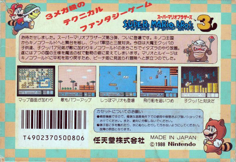
Given that Super Mario Bros. 3 was released in North America sixteen months after it was released in Japan, I find it extra puzzling that the back of the game’s box features two screenshots of a pre-release version of the game. Like, I suppose it sort of makes sense that if a game were released right after development ended, perhaps there would be confusion about which screenshots represent the finalized version of the game, but Nintendo had a long time with the Japanese version of SMB3. You’d think someone would have realized that two of the three screenshots were inaccurate.
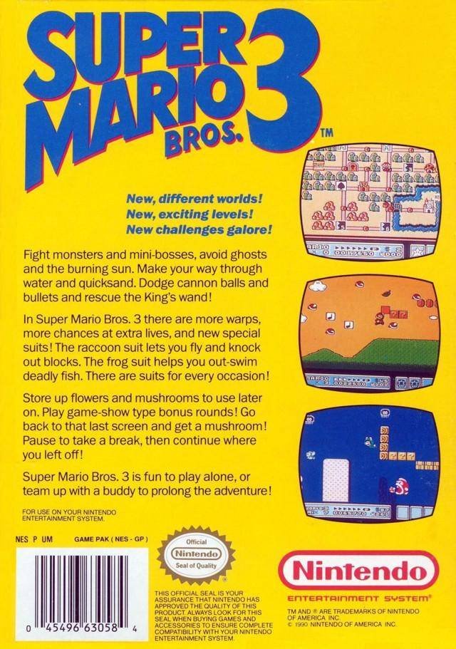
The first screenshot shows Grass Land with a different layout from its appearance in the actual game. And the second one shows Mario in a level with green hills and Para-Beetles that exists nowhere in the game at all — not even in the unused levels compiled by The Cutting Room Floor.

Left: The map of Grass Land as it appears on the back of the North American box for SMB3. Right: The map as it appears in the finalized version of the game.
I always wondered if these were perhaps screenshots used on the Japanese packaging and maybe that could explain it, but nope. The Japanese box used different ones.
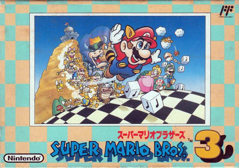
And I’d be inclined to guess it was a bad move to swap out that awesome Japanese box art for art of Raccoon Mario alone on a yellow background, but given how well SMB3 sold in North America, perhaps Nintendo knew what it was doing.
In digging around beta content for both these games, I stumbled onto an unused sprite for SMB3 Toad that is… just hideous. It’s just wrong-looking, in a way that makes me pity the poor guy. Gah.
Finally, I know I bagged on the brunette version of Peach, but when Nintendo corrected it for the Super Mario All-Stars version of Super Mario Bros. 2, the character still did not look right for reasons I can’t quite place. I’d say that maybe technical limitations made it hard to capture her hair, but the sprite from the ending of Super Mario World looks perfect.
Perhaps they just couldn’t translate this to a sprite that would be functional in Super Mario Bros. 2? Or maybe it’s that, alongside all the other ways the 16-bit upgrade skewed more toward the prototype, they reverted her eyes to black dots? “No white pixels for her eyes!” they said. Hmm.
This is the third in a little series of posts on Super Mario Bros. 3. The first one is about the history of the Goomba and whether it’s a chestnut or a mushroom, and the second one is about how SMB3 is full of callbacks to the first game, even if a lot of them got disguised in the English localization.